Self-Initiated Project
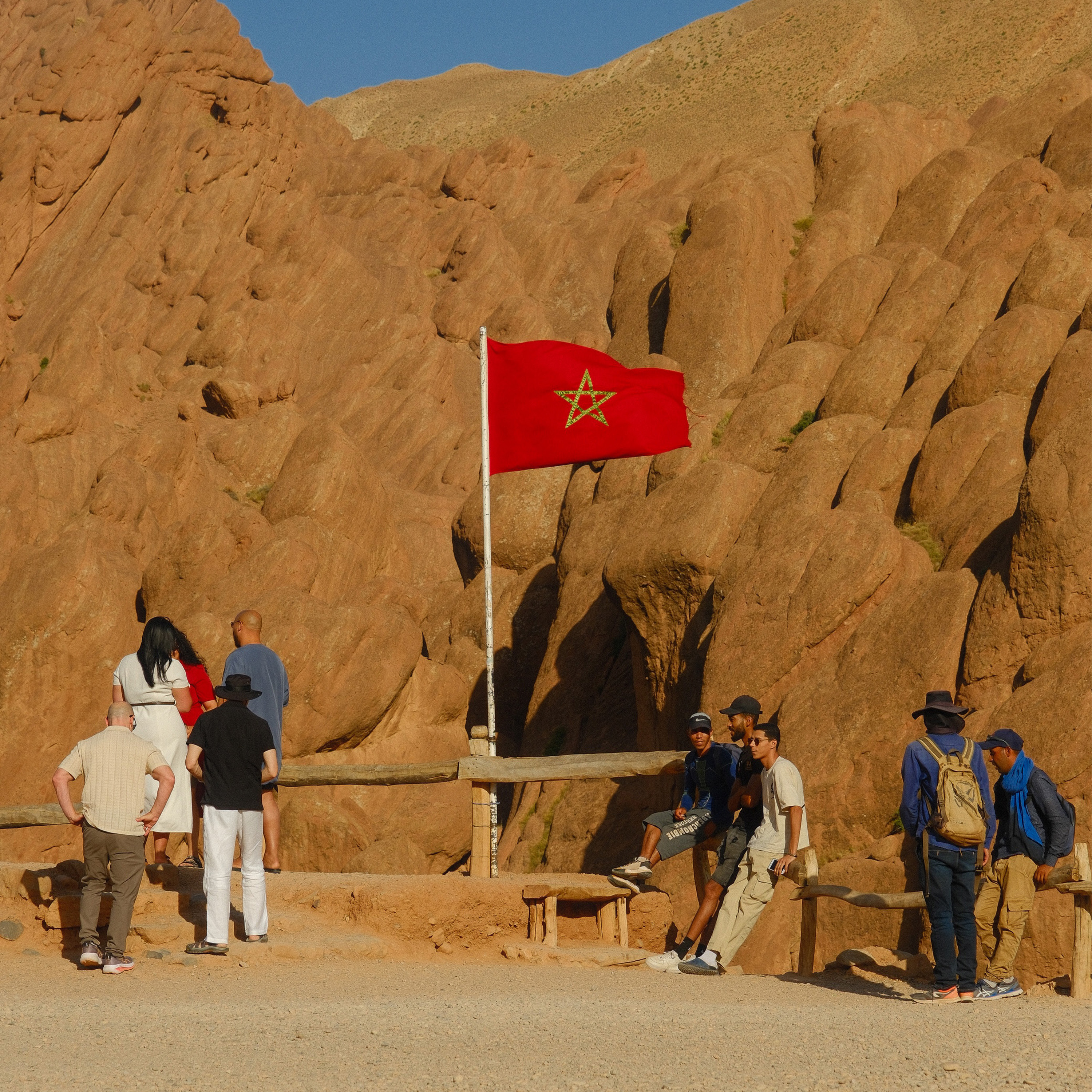
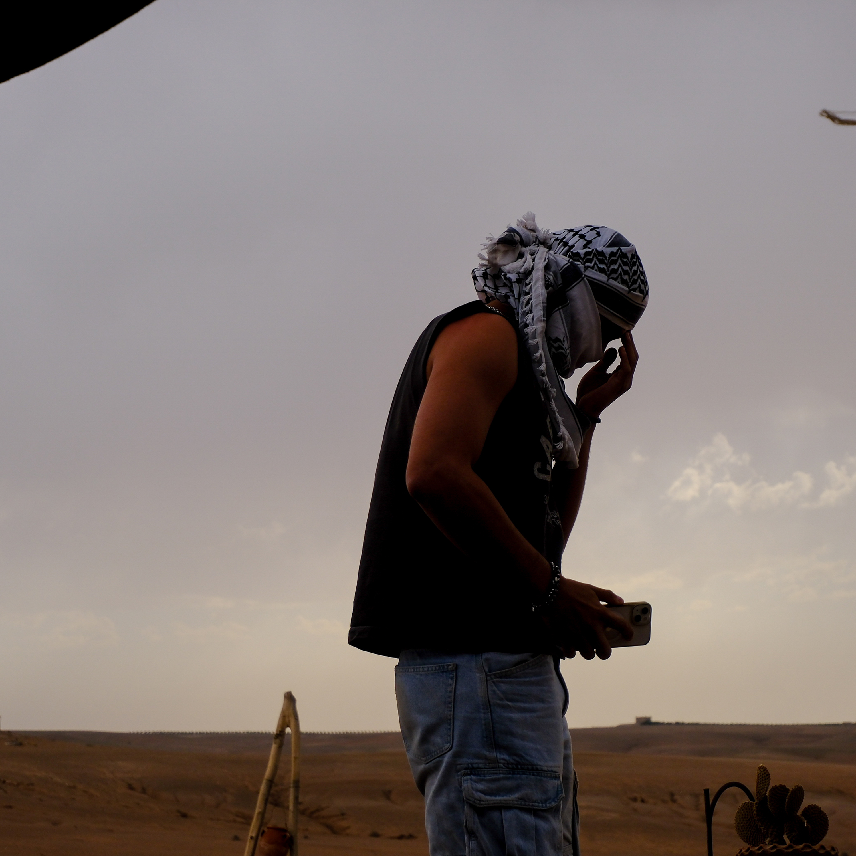
Every landscape murmurs a tale—some bold, others hushed in silence. Desert Frames is my odyssey into crafting a visual language from the stark, unyielding beauty of desert expanses, where minimal design whispers with profound clarity. Inspired by the solitude of endless sands and the pulse of modernity, I set out to forge an identity that flows effortlessly across music, editorial, and street formats. This project is more than a design exercise; it’s a meditation on restraint as a narrative force, a canvas where silence speaks louder than noise, redefining how identity emerges in a chaotic world. Through this lens, Desert Frames becomes a timeless echo—a bridge between the raw essence of nature and the sleek rhythm of contemporary expression.
The desert became my muse, not merely a backdrop but a symbol of raw, unfiltered essence where distractions dissolve into the horizon. I designed Desert Frames around three core principles that shape its soul:
Restraint: Vast empty spaces, sparse typography, and subtle hues breathe life into the identity, allowing each element to resonate with quiet authority. The absence of clutter mirrors the desert’s vastness, inviting contemplation.
Consistency: I forged a versatile system that adapts seamlessly across platforms—album covers, magazine spreads, urban posters—while retaining an unbroken thread of soulful minimalism. This coherence ensures the identity feels like a living entity, evolving yet rooted.
Coded Expression: Discreet visual cues, echoing the poised elegance of fashion and the editorial edge, hint at identity without overt declaration. A faint sand ripple here, a geometric flourish there—each mark is a subtle code, inviting viewers to decipher a modern story.
Through iterative sketches and lifelike mockups—urban posters whispering against city walls, magazine layouts unfolding like desert dunes—I brought this vision to life. The process was organic, a dance between digital precision and the tactile pulse of physical design, crafting a system that commands attention through understatement.
Album Cover Design: A minimalist sleeve where Desert Sand hues frame a silent melody, merging music with visual solitude.
Editorial Magazine Concept: A spread that reads like a desert journal, with sparse text and coded layouts reflecting editorial sophistication.
Lifestyle Mockup Application: Everyday objects—tote bags, notebooks—carry the identity, blending into modern life with understated grace.
Street Campaign Poster (DF 25): A bold yet restrained poster, its Desert Sand accent cutting through urban noise with a coded message.
Build a visual identity that transcends conventional branding with minimalist elegance: To craft a system where less is not just more, but everything—elevating design into a meditative experience.
Explore how coded design communicates modern identity with subtle strength: To prove that identity can be etched in whispers, not shouts, through discreet visual poetry.
Apply consistent principles across print, digital, and environmental formats: To create a fluid identity that adapts without losing its desert soul, from glossy pages to glowing screens to concrete walls.
Demonstrate practical impact through lifelike mockups and campaign visuals: To showcase the system’s versatility and resonance, proving its power in real-world applications.
Creative Direction, Visual Identity Design, Editorial Layout, Campaign Development, Mockup Application
Primary Accent: Desert Sand — #D4A373
A warm, muted tone drawn from desert dunes, this hue offers organic contrast against black, grounding the identity in a minimalist, soulful aesthetic that resonates with the project’s essence. It serves as a quiet anchor, its earthy warmth threading through every application, from album art to billboards.


Vailable for collaborations, commissions, and creative partnerships.
Get In TouchRaúl Mermans García — Creative Strategy, Branding & Design.
raulmermans@gmail.com